Power Reporting: Average Price Per Night Report

The Average Price Per Night report is separated into different sections. First, a graph that can be seen in line or bar chart format, followed by a summary of the Average Price Per Night for the current and previous time periods. This is then followed by breakouts, filtered by those periods and a breakout of the average price per night by rental.
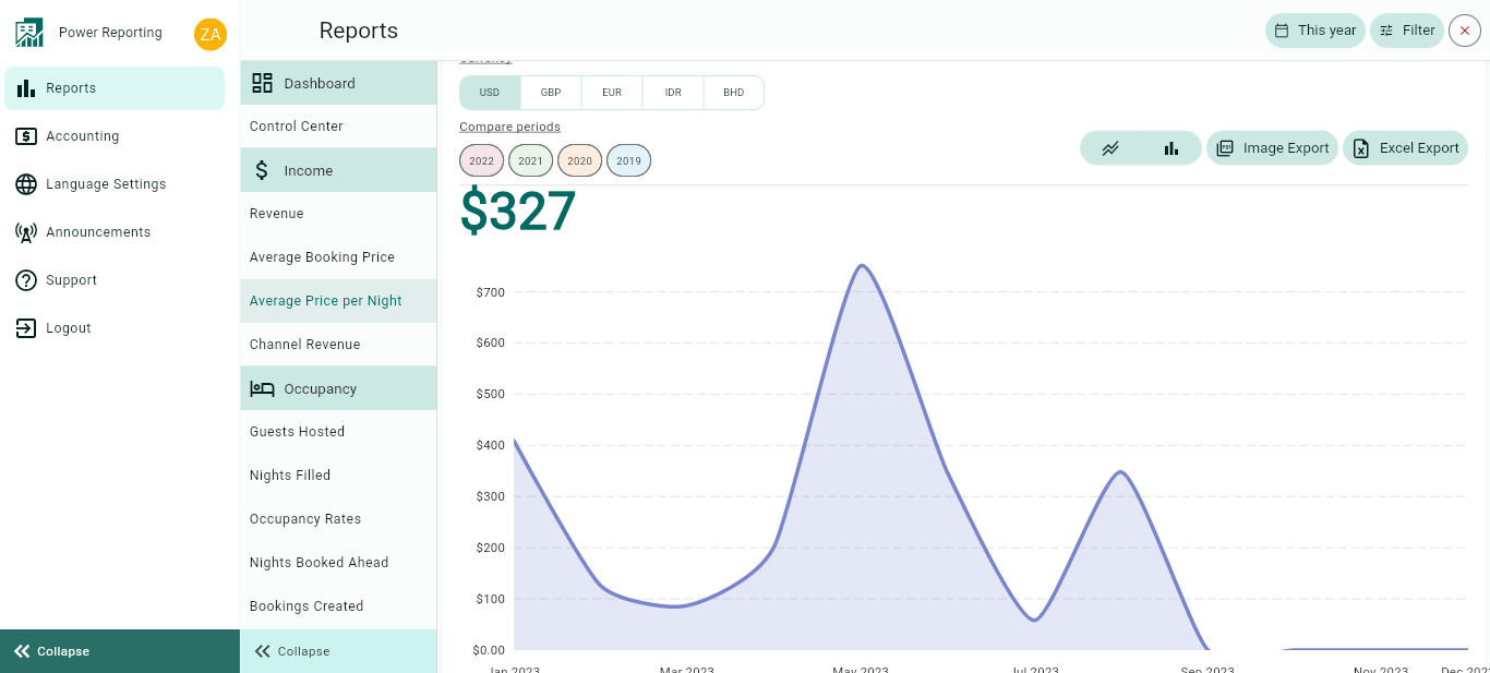
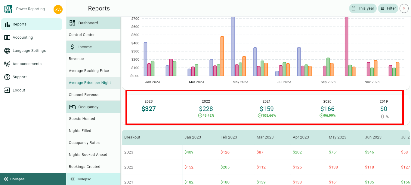
Average Price Per Night Graph
This graph shows the average price per night for all bookings within the chosen period. It takes into account all bookings with check-in dates falling within the selected period.
It corresponds to the sum of the total amounts of all bookings starting within the selected period, divided by the sum of the nights of all these bookings.
The graph allows you to change the way it is displayed, as well as allowing different export options.
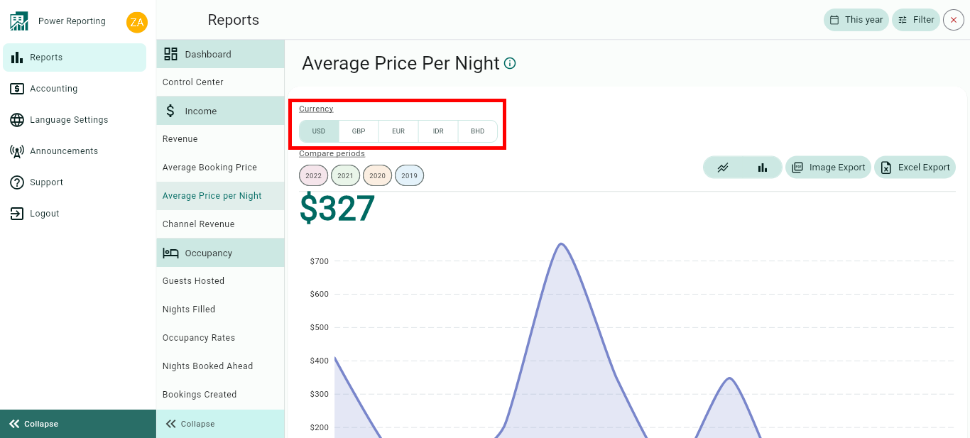
Currency:
You can easily change the currency at the top of the page.
Compare Periods:
This option allows you to select different periods and have them displayed on the graph alongside your selected filter period. With this option, you can easily compare values from the different periods.

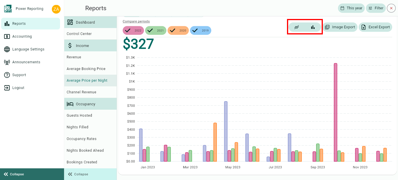
Graph type:
The default graph type that will be displayed is a line graph. You can also click on the bar chart icon to view the graph in that format instead.
Export options:
Above the graph, you will also find the option to export it in an image or Excel format.

Average Price Per Night Totals
This area shows the Average Price Per Night for your selected filter period and the previous periods so you can view a quick comparison.
E.g. if your filter is set to show the last 30 days, then each period here will be for 30 days. If you selected the last quarter, then each period will be for the last quarter and the 4 before that.
Breakouts by Time Periods
The time period selected in your filter will also have a more detailed breakout where you can get figures for each period. Using the scrollbar below will allow you to see all of the information available.
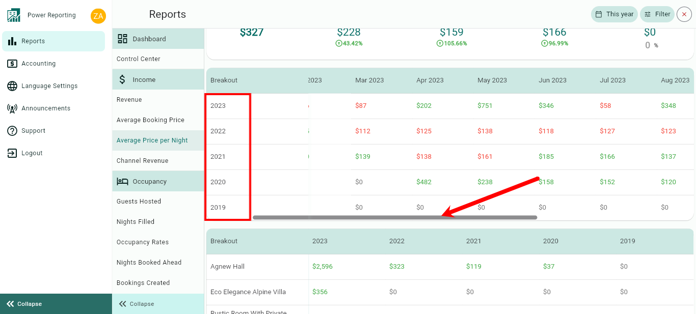
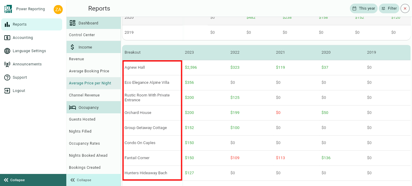
Breakouts by Rentals
The final area allows you to view a breakout by rentals for your selected time period.