Power Reporting: Money Paid Over Time

Would you like to know what the net income is for any of your Recipients (your Agency, Property Owners, etc) for any given period?
If you have been using the Accounting module and you have created Payments in your Statements, you will have this data available in the Accounting Statistics.
Just select your agency (or any other Recipient) in the Recipients list.
The Money Paid Over Time graph will show you the total amount of money that you have received during the selected period according to the outcomes of the Payments in the Accounting module > in other words, it will show you the amount the Recipients should have received after all the Accounting calculations = Net Income.
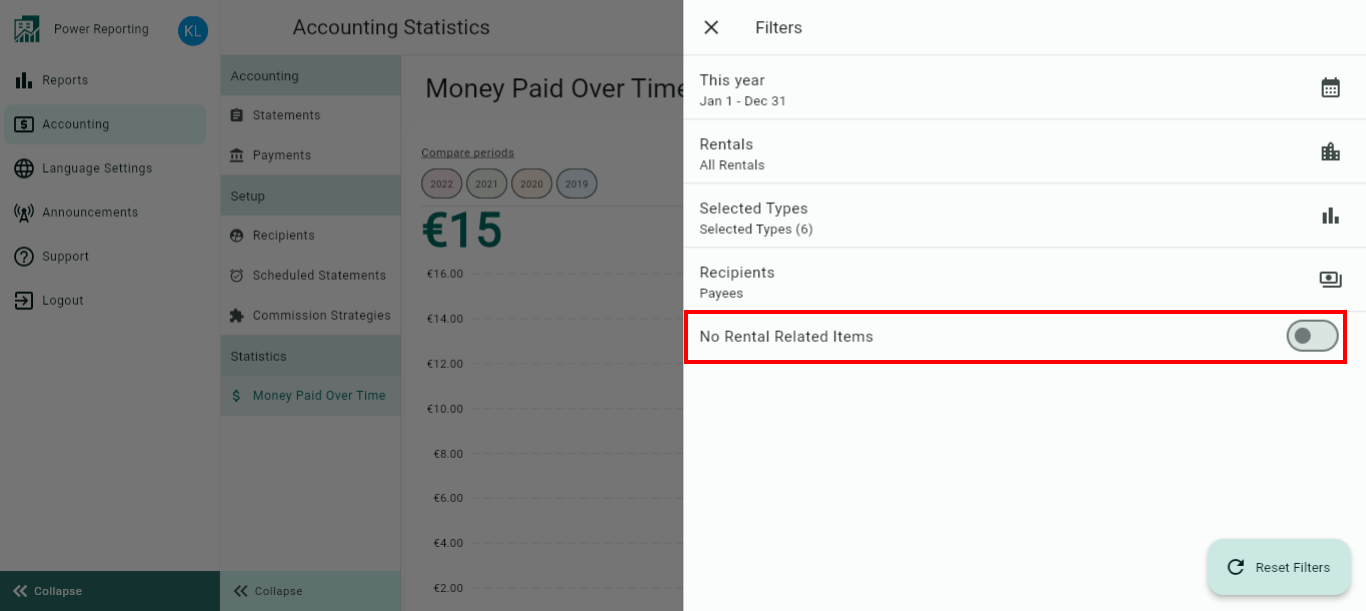
If you don't want to see invoices that are NOT related to a rental, just un-tick the filter.
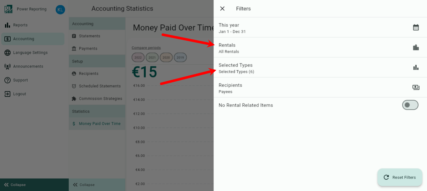
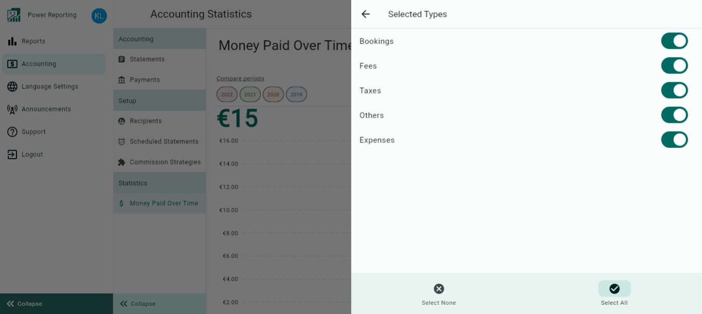
The Strategy types are set up for Recipients on the available tabs and also as Recurring Items.
Recipient Strategy Tabs:

Recurring Items:
If you don't want to see incomes that are NOT related to a Rental, just un-tick the filter for "No Rental Related Items".
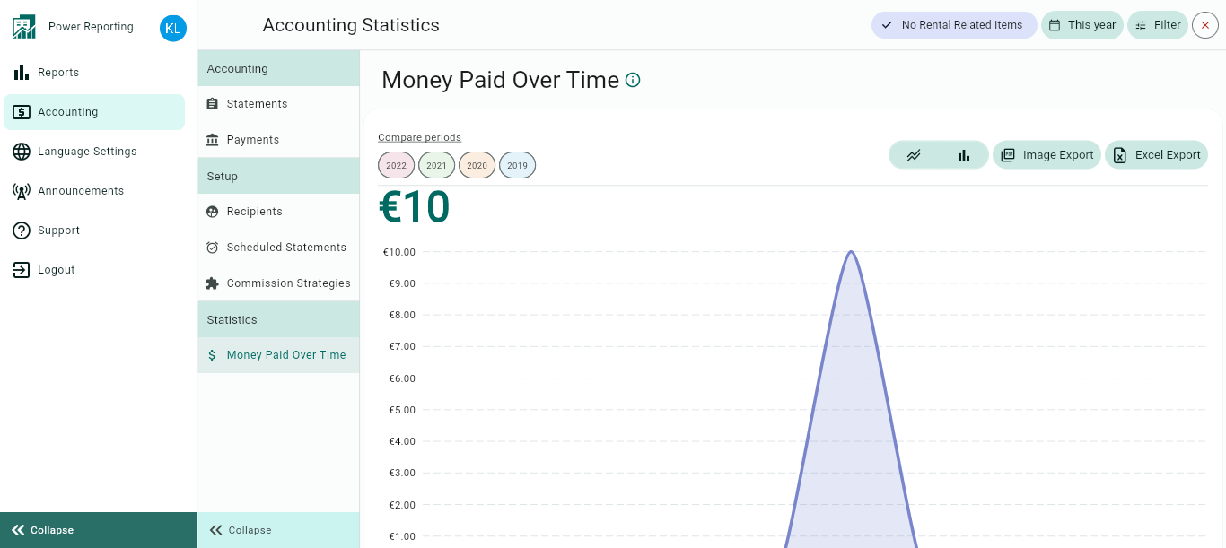
The Money Paid Over Time module is separated into different sections. First, a graph that can be seen in line or bar chart format, followed by a summary of the money paid over time for the current and previous time periods. This is then followed by breakouts, filtered by those periods and a breakout of the revenue by rental.
Money Paid Over Time Graph
The Money paid over Time graph will show you the total amount of money, that you have received during the selected period according to the outcomes of the Payments in the Accounting Module > in other words, it will show you the amount the Recipients should have received after all the Accounting calculations = net income.
The graph allows you to change the way it is displayed, as well as allowing different export options.
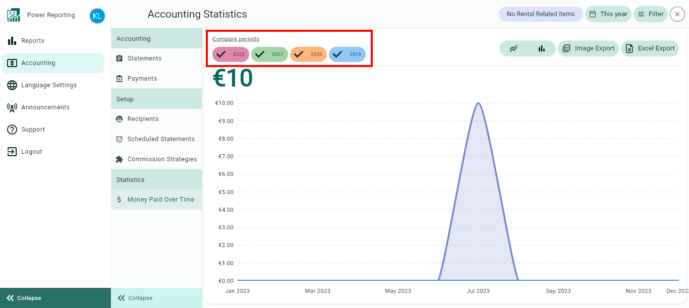
Compare Periods:
This option allows you to select different periods and have them displayed on the graph alongside your selected filter period. With this option, you can easily compare values from the different periods.
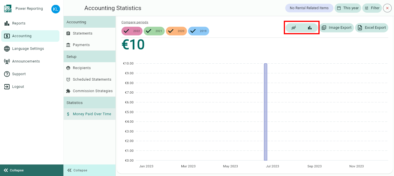
Graph type:
The default graph type that will be displayed is a line graph. You can also click on the bar chart icon to view the graph in that format instead.
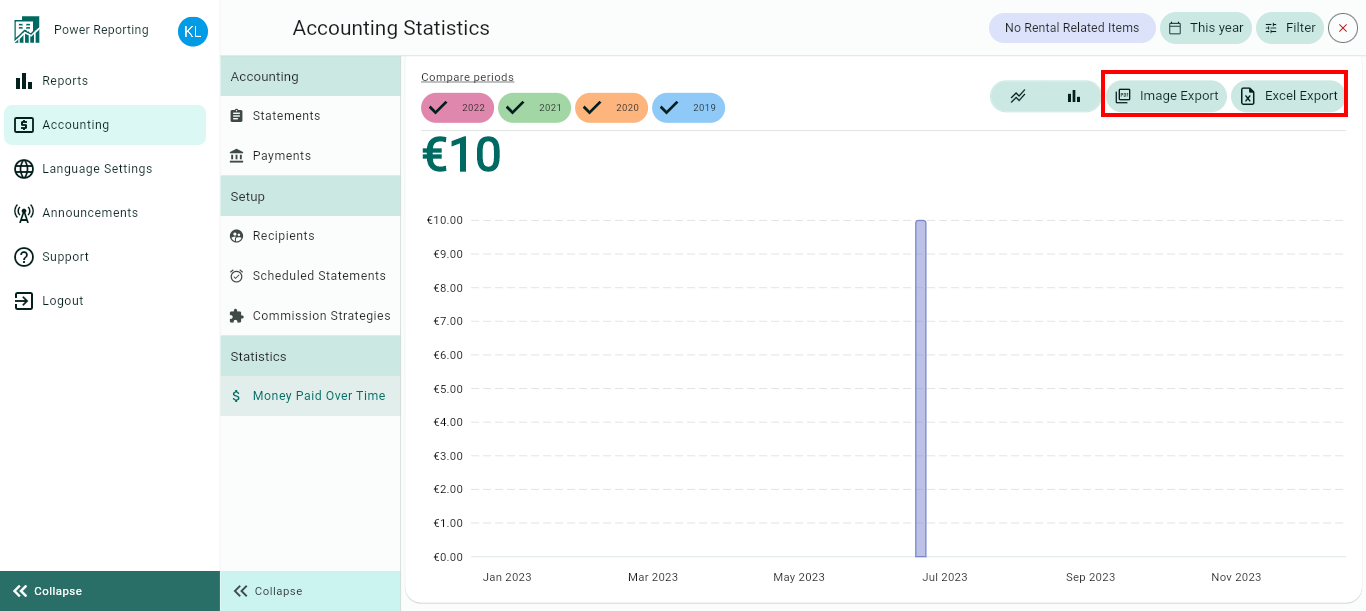
Export options:
Above the graph, you will also find the option to export it in an image or Excel format.
Money Paid Over Time Totals
This area shows the total revenue for your selected filter period and the previous periods so you can view a quick comparison.
E.g. if your filter is set to show the last 30 days, then each period here will be for 30 days. If you selected the last quarter, then each period will be for the last quarter and the 4 before that.

Breakouts by Time Periods
The time period selected in your filter will also have a more detailed breakout where you can get figures for each period. Using the scrollbar below will allow you to see all of the information available.
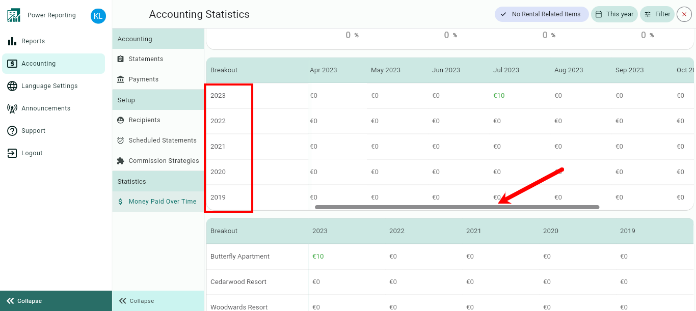
Breakouts by Rentals
The final area allows you to view a breakout by rentals for your selected time period.
